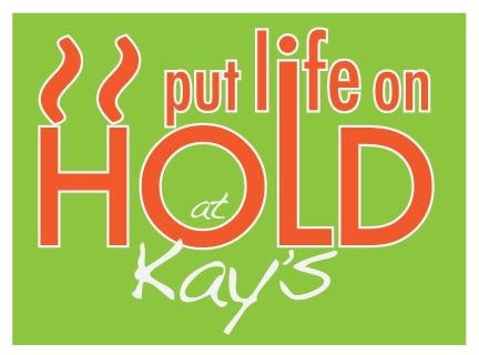
We took part in a re-branding project this past term, and chose Kay's Delicatessen - a lovely deli, situated close to the college. This logo didn't become a part of our project, but I still like how it turned out.
Tilde, represents heat lines, as well as the "pause" symbol. For more information about this wonderful family-owned and opperated restaurant, visit their blog here at
Kay's Delicatessen.

No comments:
Post a Comment
Thanks for the comment! :) I'll get back to you as soon as I can! :)